McDonald’s
Two soda cup designs which fit within a holistic brand look for McDonald’s. Both reflect the behaviour of the product within, one the sloshiness of the liquid, and the other uses the golden arches icon to emulate ice falling and floating, leaving trails of bubbles, visible as you turn the cup.
Packaging design, illustration.


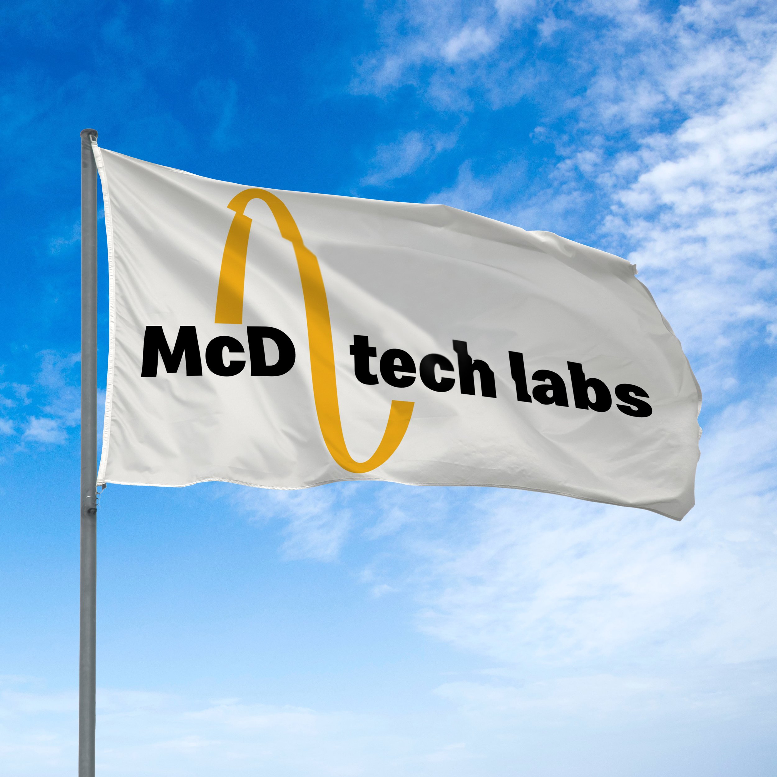
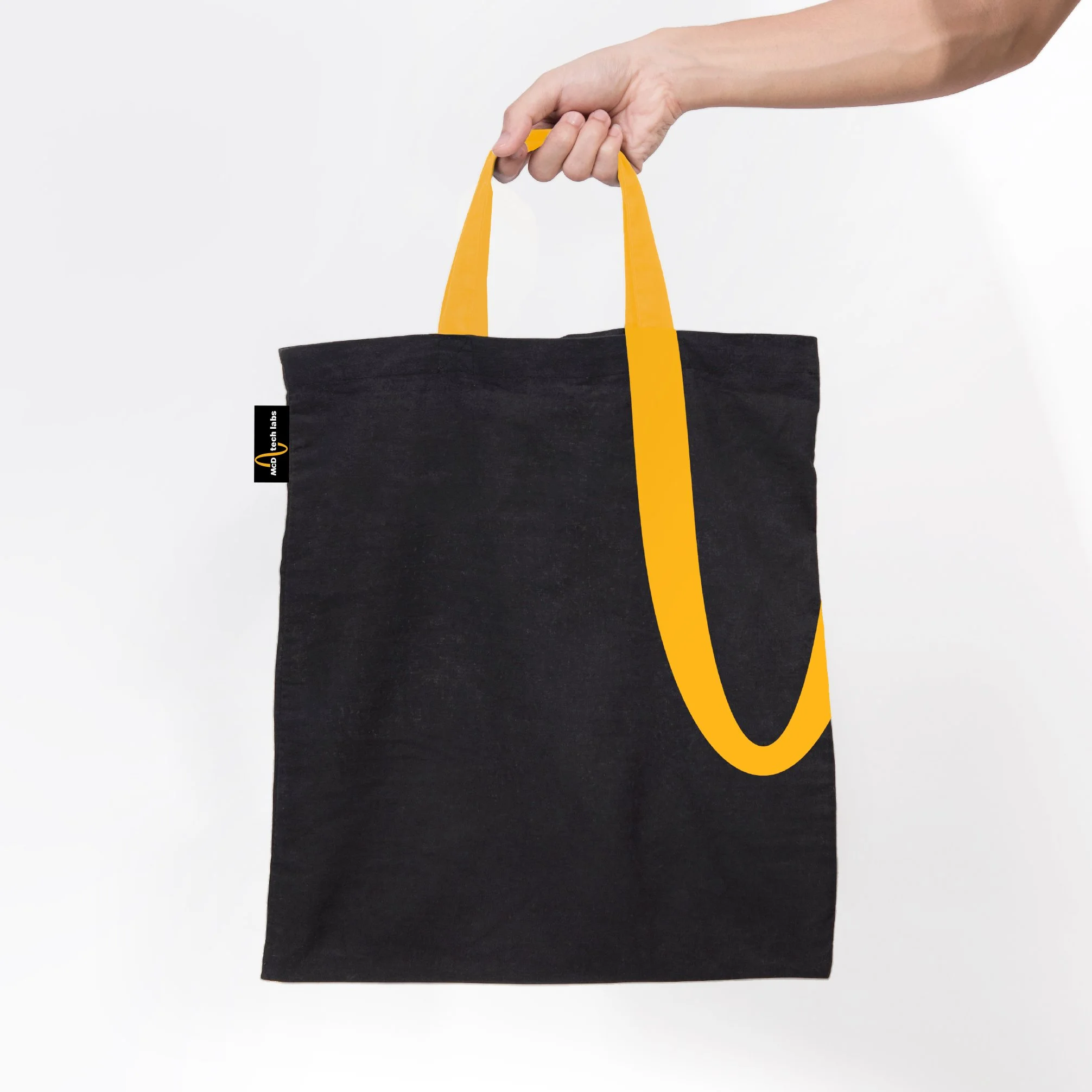
McD Tech Labs
When McDonalds acquired a voice AI system for use in drive through fast-food ordering, it needed a logo that differentiated this new side of the business, but had a clear link back to McDonald's.
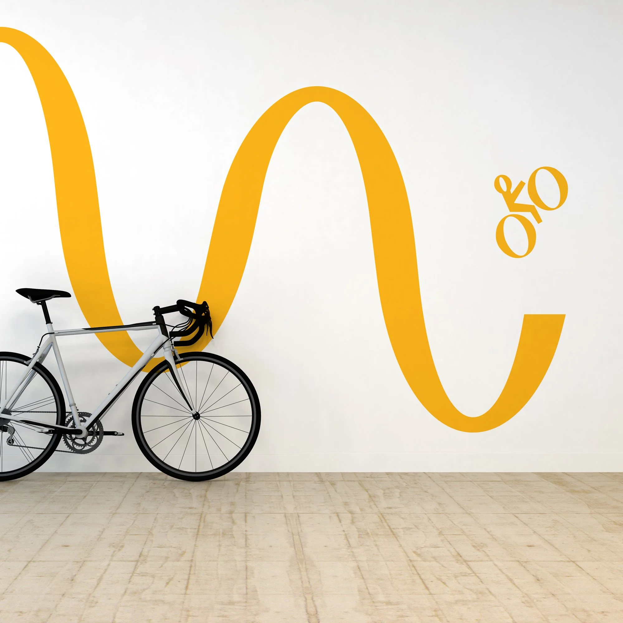
This logo references both sound waves, a nod to voice recognition, and brain waves, representing innovation and is directly informed by the Golden Arches. The thick and thin quality of the wave in turn informs a series of icons and other communications, creating a strong visual language and identity.
Logo and visual identity design.
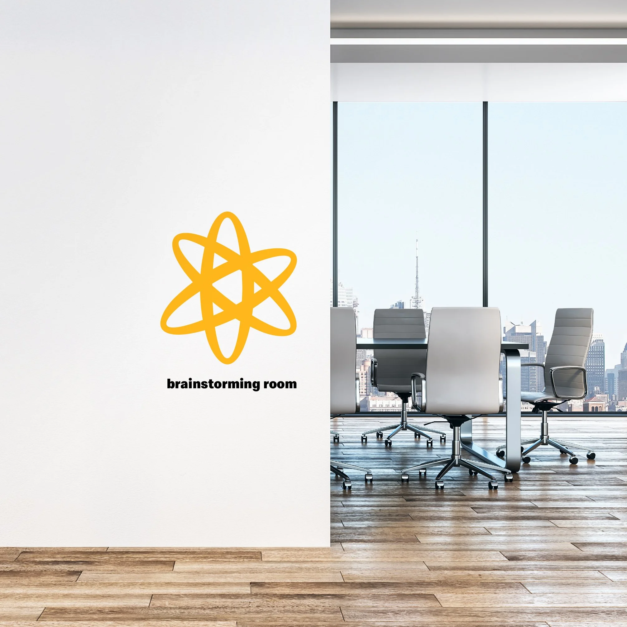
The logo graphic can be tiled to create a continuous wave and used as a path to link words and ideas.